Wow, it’s quite amazing how many web designers get the about page wrong.
I’m not talking about local web designers. (Who knows what they are doing!?)
I’m talking about the professional web designers that create themes for popular systems like WordPress, Wix, and Squarespace.
These templates all include a sample about page…
…and most get it wrong.
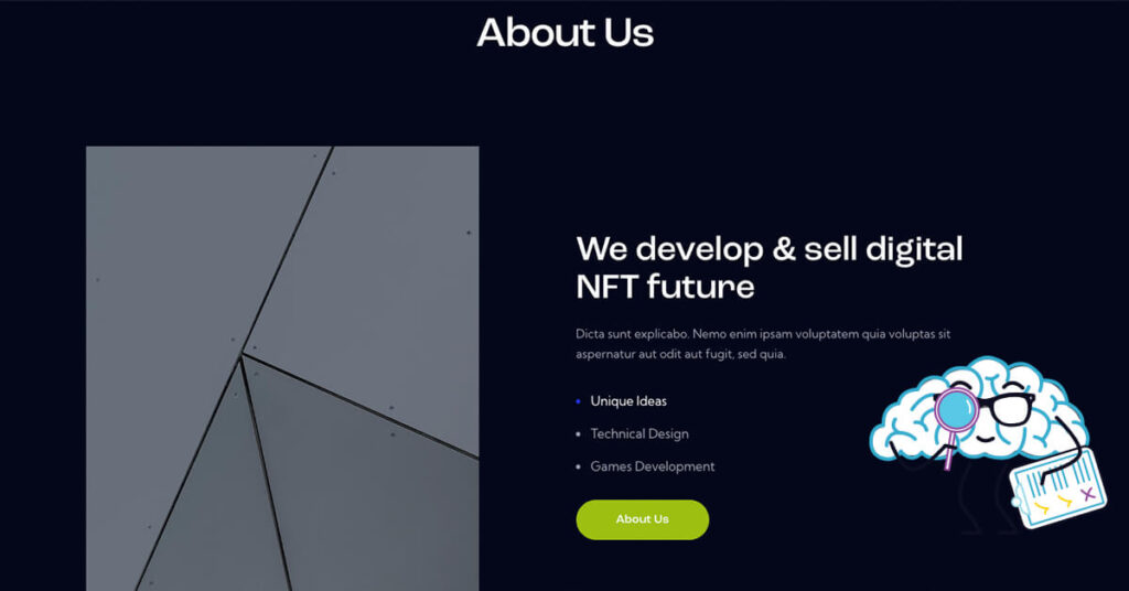
Design Over Content – The Wrong Way to Build an About Page
Your website is not an art gallery. Users don’t stand around in awe, theorizing why the designer decided to use a color or font.
Users want answers. They want to see if you can solve their problem.
Design matters, but only in relation to how easy it is to find answers.
I love graphic designers, but they have different motives.
They want something visually appealing.
- Does the website design represent the brand?
- Enhance the brand?
- Make a lasting impression?
You can do this with Lorem Ipsum filler text.
If you focus on design first and not the message, you can miss entirely.
But, if you focus on content first and then use design to enhance your content – that’s the winning formula.
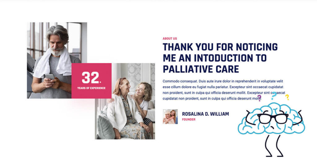
Template Web Designers Don’t Know Your Content
If the designers don’t know what you’re going to say, how can they make a design that an enhances your message?
You have choices:
- Break their design with your content
- Pigeon hole your content in their design
I don’t like either option.
Sacrifice your message? No thanks.
Break the design (the whole reason you picked the theme)? Nope.
Unless you have an amazing design eye (and know how to code with CSS), you have yourself a problem.
Thanks a lot web designers.
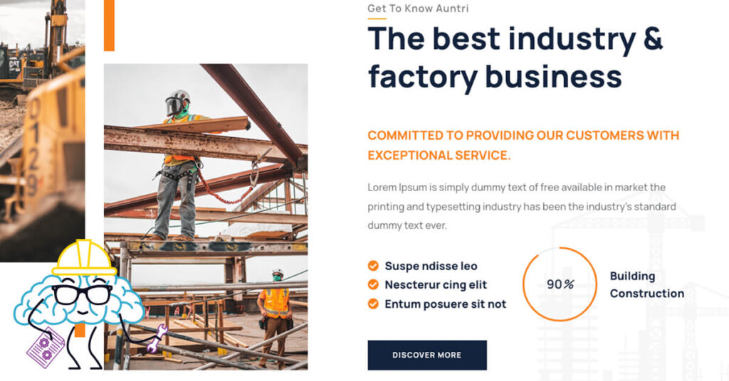
What are Template Web Designers Doing Wrong?
About pages should be about your customer, not you.
The message needs to showcase how you can solve their problems, not just list all of your business accomplishments and details.
Want to Learn How to Make a Better About Page? We Offer Some Help.
When you view a template about page, you see the same things:
- Number counters for some random stats
- Generic listing of services
- A blog list
- Team carousel
- Portfolio links
- Testimonials slider
- Contact form
These features all make sense, when used correctly.
But when you look at the placement and same copy, we are missing the mark.
Most of the time we list our mission and vision front and center.
No one cares. We want to know why you can help us.
We then list our “numbers”. Eh, that’s great and all, but all relative.
Lists our services. Great, this is helpful. Except you are telling me what the service is, not how it will help me.
At first glance, the design and content look fine – but if we simply emulate the cookie cutter content, we make a bad about page.
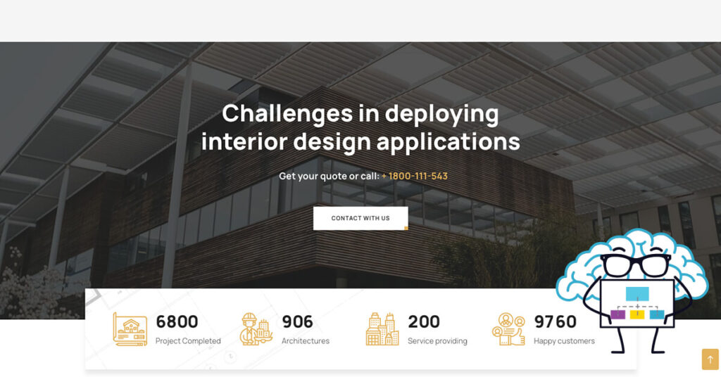
Fixing the Template About Page
We’ve identified the problem. The template pages aren’t great for content and design.
You need to start with content.
Focus on the customer.
Once you have your copy, you need to tweak the design.
Screen Capture
Most designers make reusable templates for different sections of the website. Depending on the web design builder/tool, you can copy or insert these templates where necessary.
I often go through all of the default demo pages and screen capture the entire page.
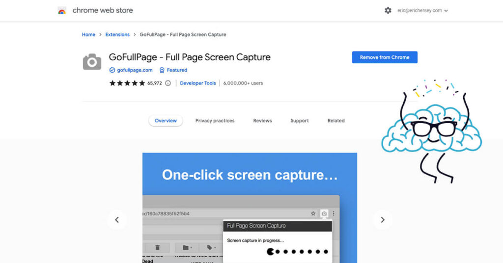
The easiest way to print a website is to download a Screen Capturing Extension for your Browser. One of my favorites (for Chrome) is GoFullPage. It will capture the entire page and allow you to export as a PDF to print.
By printing these full pages out, I can get a good visual of the different templates.
You can take these printouts and wireframe your design.
Match the Content to the Right Template
Look at your content. Build the design around the content.
Do you need imagery with a paragraph? Find a template that offers this option.
You will often need to break out the content into bite sized chunks. Find templates that flow from paragraph to paragraph, but don’t come off as text heavy.
If you find it helpful, cut out the printouts and build your page like a puzzle.
Although you might not get every design aspect right, you are better than starting from scratch.
Who Cares. It’s Easier to Fill in the Blanks on the Template
You could remove the standard content and add in your verbiage and get it done, right?
Sure. Who looks at the about page anyway?
Well, nearly everyone shopping your brand looks at your about page.
Taking the easy way on this page might not be the best answer.
If you want to cut corners, don’t do it on one of you most viewed pages.
Sometimes the little things make a difference. You might think that you should copy the pros, but these are professional designers…professionals at making themes. These are not professional copyrighters – or marketers.
They did their job and made you a beautiful theme.
You still need to do your job. Sell your project.
If you don’t want to do it, hire a pro that will.

About the Author
Eric Hersey
Eric is your Ohio Valley Web Design and a Content Marketing Specialist. Eric’s main goal is to Make a Better Web for the Ohio Valley. Eric helps local businesses and brands create content calendars, social media strategies, and provides guidance on what pages and topics to create that will deliver RESULTS. Eric has published hundreds of original articles over the past several years (web design, SEO, content marketing, and branding).


