I discovered a YouTuber last week and one of his videos talked about Netflix.
He wasn’t talking about his favorite shows or the best of Netflix. He talked about the abundance of shows on Netflix.
You would think this was a good thing. It was not.
He was talking about Analysis paralysis.
And of course, I related this to websites.
Analysis Paralysis
Analysis paralysis is a phenomenon in which a person is unable to make a decision due to overthinking and over-analyzing the situation, to the point that it becomes incapacitating.
This can happen when there is an abundance of information available and a fear of making the wrong decision, which leads to excessive contemplation and examination of the options.
As a result, they become unable to choose a course of action, and the situation remains unresolved.
Okay – so no one really fears making the wrong decision on a website. As I’ve told many clients, websites are not life or death.
Analysis paralysis happens on websites, but maybe we call it something else.
Paradox of Choice
The Paradox of Choice is when someone has too many options to choose from which can lead to decreased satisfaction with the choice made, and even cause anxiety or indecision. Having unlimited choices in decision making can be overwhelming and may lead to feelings of regret, or an endless cycle of “what if” thinking.
The paradox of choice states that having more options does not necessarily lead to more happiness or better outcomes. Instead, having too many options can lead to greater dissatisfaction and indecision, as people feel overwhelmed by the endless possibilities and struggle to determine the best choice for themselves.
So do we have endless possibilities on websites? Probably not. For each page you add, you are creating a new combination of orders your page can be consumed, but why would that matter? I don’t think it does.
So what are you getting at? Why are we talking about unlimited options and choices?
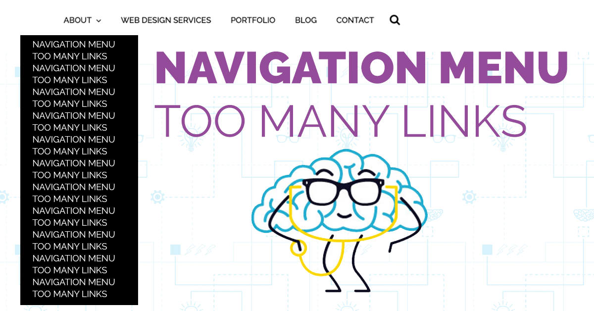
We are talking about the navigation menu, my friends. The lovely place at the top of most websites that display your most important links. The item that is on nearly every page.

How Many Links Should Be on a Websites Navigation Menu?
You should limit your websites navigation menu to 6-8 links.
Most websites that are viewed on a laptop or desktop can handle six to eight links, preferably one-word for each link. Users expect to see a few common pages, including a contact or service link.
These links should be the most relevant pages for users landing on your site. They should be the hub pages for deeper navigation.
For example, your About Page can have additional links in the body of the page for Meet the Staff of Company Values. The About Page will be on the main navigation and likely a top three visited page on your site.
Should you use drop-down menus on your navigation menu?
Using a drop-down menu on your website is a personal preference based on design and organization. If you can avoid using a drop-down menu, you should.
Drop-down menus tend to be more difficult to use on mobile devices, hence making the user experience less than satisfactory for most of your users. Drop-down menus in your navigation can also slow your website down based on having to load additional scripts or code.
If you are going to use a drop-down menu, make sure the list remains small. Three to four items would be optimal. A menu that flows to the bottom of the screen causes analysis paralysis.
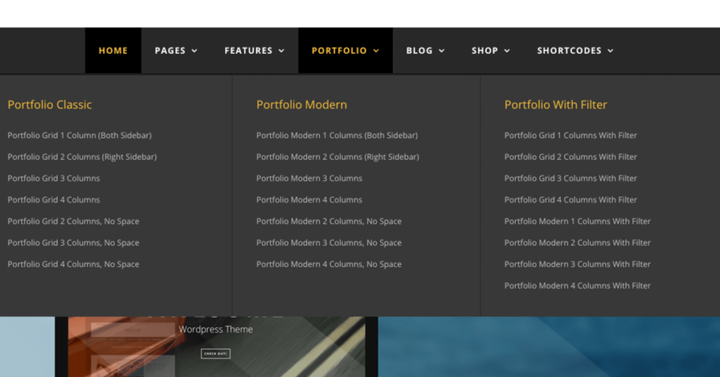
Should you use a Mega Menu on your website?
A Mega Menu, also known as a Mega Dropdown Menu, is a type of menu that contains multiple columns of content within a dropdown menu. It is usually used as a primary navigation tool on websites with a large amount of content, making it easier for users to find what they are looking for.
You’ve seen these menus on most eCommerce websites.
I don’t hate Mega Menus. They are certainly better than having ten items in a drop-down.
Mega Menus help to improve the user experience by reducing the number of clicks required to access specific pages and providing a clear overview of the website’s content. If you have a ton of popular sections on your website, a mega menu helps the user get to the location faster and easier.
The goal for most websites is to get to every possible page in less than 3-clicks. Mega menus make it possible for larger websites.
Again, they work best on desktop. If you use a mega menu, you better have an option for mobile.
How many links should you have on your mobile phone website navigation?
Keep your navigation menu to a minimum on your mobile-friendly website. Stick with the standard 6-8 links, but understand they will display as a drop-down.
If you haven’t heard of a hamburger menu, you’ve at least seen one. Hamburger menus look like a sand which. They are usually three lines and located in the top right. When you click on it, a drop-down menu appears on your screen. This is standard practice for a mobile website or app.

Here’s the thing – you can have a ton of links since a user can easily scroll, but you shouldn’t.
The number one thing you need to make sure of – the links are big enough. This means you can’t cram a bunch of links without any padding on the top or the bottom.
Try and avoid the user from having to scroll. They will accidentally click when scrolling and land on a page they didn’t want. The analytics nerd in me screams because this makes it look like pages or more popular and their immediate return to the previous screen makes us think the user didn’t like the page. No, this was just an accidental click.
What core pages should you include on your navigation menu?
We want to avoid the user from being overwhelmed. Guide them down the path before you content vomit all over them.
Make it easy.
Common websites include:
- About
- Services/Products
- Contact
- News/Blog
- Portfolio/Work/Case Studies
- Call-to-Action
- Depending on the layout, you might want to list the Home page.
I won’t lie, I think this is unnecessary. The home page is usually the logo and most users have figured this out. Also, the homepage is a nice landing page but it’s just a highlight real for your pain pages. Pointing them back the home page is essentially giving them the navigation menu options again, but with more pictures.
For basic small business websites that don’t have a blog or news, list your main services. If you offer three services, put them on the main navigation.
What is the job of your website navigation menu?
the job of a website navigation menu is to make it easy for visitors to find the information they want and to provide a clear structure for the website’s content. These will be the most viewed and accessible pages, so make them count.
This is your opportunity to navigate the traffic and segment your audience into content that relates to them.
Just because you have a page on your site and 1 user out of 100 might need it, that’s not a reason to use that valuable real estate and risk analysis paralysis or have someone struggle with the paradox of choice.
Imagine Netflix if they decided to give us 6-8 categories options instead of thousands of shows.
- Do we want comedy, drama, or documentary?
- A show or a movie?
- New release or classic?
Just asking these questions might help us actually pick a show and stop our endless searching….or prevent us from closing the app altogether and watching TikTok on our phone.
Limit your menu to 6-8 items.

About the Author
Eric Hersey
Eric is your Ohio Valley Web Design and a Content Marketing Specialist. Eric’s main goal is to Make a Better Web for the Ohio Valley. Eric helps local businesses and brands create content calendars, social media strategies, and provides guidance on what pages and topics to create that will deliver RESULTS. Eric has published hundreds of original articles over the past several years (web design, SEO, content marketing, and branding).
