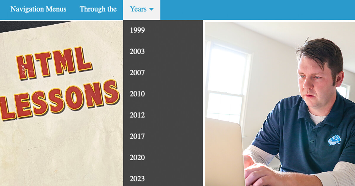
I wasn’t around at the very start of the internet, but I’m fairly certain I’ve seen the evolution of the navigation menu.
Gather around fellow nerds and let’s talk about the trials snd tribulations of making navigation menus for websites.
HTML and Hyperlinks
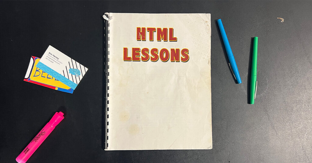
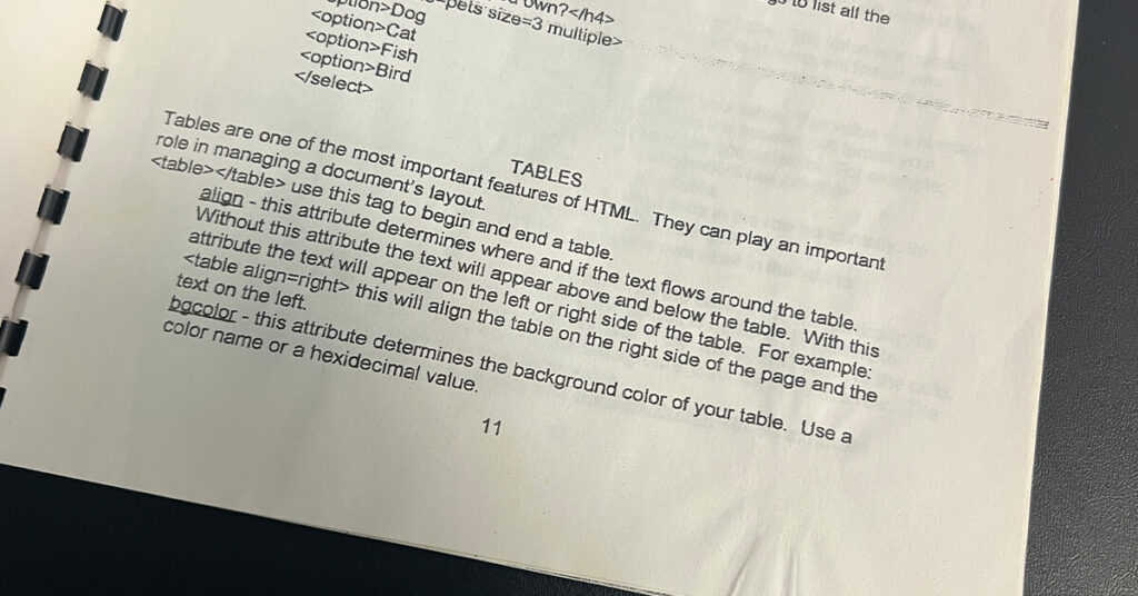
I sat in my sophomore tech prep class (what they called our multimedia computer class) and was tasked with learning HTML. My beginner “handbook” was awfully handy.
Hello World!
Weeks later, after making some very basic pages, we learned that we could link all of our pages together.
Hyperlinks were a pretty simple concept to understand. It’s been about 5-years since my first experience on AOL. Websites are made up of interconnecting webpages. To make it easy, we should make a universal menu that includes links to our most popular pages.
We spent a few periods crafting up a section of HTML code that we would place at the top of every page. With a simple copy and paste, we could get around our entire site by using our navigation menu. Technology at its finest.
….and then we wanted to add another page.
You know what that meant? We had to go through and update the code on every page. Thankfully we only had a few pages, but imagine this happening to a big website.
There had to be a better way.

Frames
Skip towards the back of our HTML book and we found a section on frames.
Remember when navigation menus were primarily located on the left side of the website?
Better yet, do you remember when most links on websites were actually image files with the actual text embedded on the graphic?
Frames gave us more flexibility and the ability to show two individual pages on one screen. We could make one page and call it navigation.html and have it show up on every page. Now if we wanted to add an item to our menu, we could just do it in the navigation.html and it would display everywhere. What an upgrade!
Even better, we figured out how to make our menu look super cool. With a little bit of Photoshop work, you could design a button and link to your page. What is equivalent to our modern sidebar, we created our website navigation using this tactic. And boy did they look great.
Tables
There were plenty of issues with designing navigation menus and using frames. But the biggest concern came when designers wanted MORE CONTROL. No longer were we just happy with our standard markup. We savvy designers learned that we could manipulate tables and create “pixel perfect” designs. We could wireframe a design in Photoshop and could figure out how to grid a great looking design.
The frames got in the way. It was time to make a better navigation menu using tables.
Sure, we ran into the whole “change the whole website” when we made a change – but the design looked soooo much better!
Flash
And then came Flash.
Nope, not gonna talk about Flash.
Just know, we used it for a while…and then stopped.
PHP
Besides being a ridiculous acronym (the P in PHP stands for PHP), this a server-side scripting language came to the rescue. Much like frames, you could make individual pages and embed in the site.
As a novice designer, it took a while for me to grasp the concept of how to load a PHP site on my computer, but thankfully I had a few smart friends that gave me detailed directions. The code worked nearly the same as HTML, but I was introduced to relative links/paths. For the sake of boring everyone, let’s just say it allowed us to move around files in the backend a lot easier.
PHP is still used to this day, by popular website builders and CMS platforms – like WordPress.
CSS
We were using images as links for the navigation menu. This had to stop.
I distinctly remember having to make changes to my Photoshop graphics anytime I wanted to add a new menu item. I had to find the template on my computer, hope I still had it, and save and upload a new graphic. It was a bit annoying.
When Cascading Style Sheets was introduced, we could make things look pretty without using images everywhere. Websites were faster (less graphic load) and we could make mass changes easier.
You could also create drop-down menus using CSS. You could hover over an item and have an additional menu drop down. This was a game-changer.
We use CSS to this day.
Frameworks & Bootstrap
Menus with CSS helped evolve our websites, but they weren’t as smooth as one would like. Actually, it became pretty complex to make a nice nested menu. The HTML, when done correctly, had list items nested in other list items. Long story short, it took a long time to make a menu look great….
And then we added in mobile phones.
Responsive web design became super important. Menus needed to adapt to your phone. We welcomed the famous hamburger menu. Using CSS, we could transform our code into a little icon that would pull out when you triggered the event on mobile phones.
But this wasn’t going to be easy.
Or was it?!
There were a lot of smart developers out there that realized we weren’t going to be changing the mechanics of of these menus. They developed frameworks to make life easier for themselves – and then passed on the love to us.
Bootstrap, a popular framework, made it easy to drop in some CSS and make a beautiful, functional menu in no time flat. Not only was it easy, they did the heavy lifting and made it accessible and easy for search engines to understand. The documentation was clear and easy.
WordPress Plugins and Add-Ons
As WordPress websites started to take over the web, menus were embedded in themes and the code wasn’t much of a problem. But not every theme had the perfect solution. In fact, it was actually a bit difficult to customize the menu from the theme.
Knowing there was a problem, developers found a solution. They developed some add-ons (some free and some premium) to add functionality to the websites. If you want a mega menu, there’s a plug-in for that. Feel like changing up the hamburger menu, find a plug-in.
Navigation Menus – NOW
Navigation menu technology has changed over the years – for the better. It’s easy to implement a menu on your site and fairly easy to customize. We, designers, honestly don’t give it a second thought.
Although navigation menus are easy to implement, we still can’t stop the misuse and misunderstanding of best practices. Just because we have the tools doesn’t mean we are all skilled mechanics.
Not sure how to implement a navigation menu on your site, take a look at these top tips for Navigation Menus.
I’ll report back when technology changes and we find a new, better way to evolve our menus.

About the Author
Eric Hersey
Eric Hersey is a Wheeling Web Designer and Digital Marketing Specialist that has been working in graphic and web design since 1999. He has applied his techniques and knowledge to help craft his own personal brand and hobby sites – but has also helped many brands and businesses grow online using powerful organic search tactics.
