
Only if websites had a check engine light.

People and businesses have been making websites since the mid-90s. Sure, the internet was around before then, but most of us didn’t discover websites until AOL started hammering us with advertisements.
Fast forward to the present day, we have the possibility of seeing 25-year old websites. Unlike classic cars, they don’t get specialized license plates. Also, they don’t retain their value. I might be the only person that would show up to a “Classic Website Show”.
Most website owners have been able to see trends through the years and made a call to a web designer to get the update. Some trends were easy to spot. Others, not so much.
Website Red Flags – Flash, Frames, and Tables
These are the easiest to spot. If the website looks like a high school student made this in 2003, it’s probably a Flash website, frame website, or pure table website.
Macromedia (Adobe) Flash
Flash websites were fun. Everything was animated. You could easily integrate sounds and videos. Life was good – in 2002.

When iPhones came around, Flash died. When the most popular mobile browser stopped you from viewing a page, that’s bad. Even worse, Google and search engines couldn’t index the content on a Flash site. All of those words embedded – they didn’t exist.
If you have a Flash website, run to the nearest web designer.
Frames
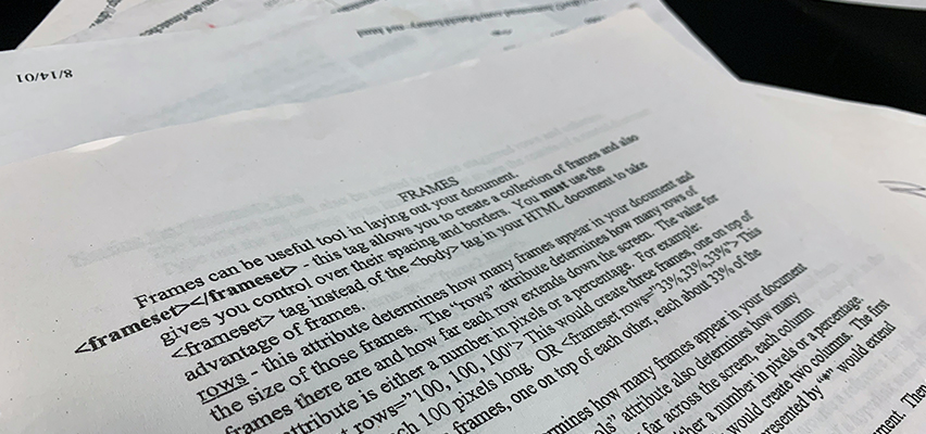
I have not seen a frame website for a long time. They are probably like the dodo bird and extinct. These websites were helpful in the early days, but there is no need today.
Basically, you could have two (or more) pages displayed on one browser screen. Often this was used to make a navigation menu. The browsers let you resize the frames (sometimes) and allowed for pure silliness in design. PHP includes allowing this work a lot easier.
Tables
Not all tables are bad. I often use tables on websites. I, however, will not design a website using a table. At one time, this was a great way to control the look of your website.
We now have responsive design and use CSS to dictate the design. Picture pulling up an Excel document and resizing and merging rows and cells to get a design. This was creating a website using tables. Once again, mobile phones changed the game.
The History of the Web has an interesting article about Tables for Layout.
Old Website Technology
Technology evolves so quickly. When I first made websites in 1999, I knew HTML. I hacked my way around the language and managed to make decent looking sites. Today. I need to be competent in dozens of languages and tools to make a decent looking website.
Pure HTML
If you look at your browser and you see .html or .htm – it’s time for an update. Unless that website has been sitting dormant for years, you are probably putting way too much time in updating things and there is an easier way. You should never have to update your navigation menu on every page.
Also included in this category are websites ending in .php. You probably don’t need to recreate this site, but you should learn how to use .htaccess.
M.ade for Mobile
When mobile phones jumped on the scene, the smart marketers realized they needed to customize for the web. You started seeing domains that were strictly made for your phone. Remember seeing URLs like m.ericherseyweb.com? This was a completely mobile version of your website. Sometimes you were puling information in from a database and other situations you needed to make two separate updates. This could be problematic. This version only appeared when you were on a mobile phone.
Mobile websites didn’t go anywhere – technology just helped out a bit. Now you can make ONE website that confirms to multiple screens. Responsive web design is the best way to make a website. Often you will hear designers even say “Mobile First” in terms of designing. Google also understands the importance of having a mobile-friendly website – you are penalized in the ranks if you are not ‘friendly’.
Smart people even talk about why M-Dot sites don’t work anymore.
One-Size Doesn’t Fit All
Much like the discussion on mobile-friendly websites, designers wanted to have complete control of their layout. It was popular to design for the most common screen size and move forward. This left a lot of websites out there that work well on older desktops. Once you resize your browser, that content didn’t budge and images/paragraphs were soon cut off.
This is somewhat hard to identify from your desktop. Most of us have big enough monitors where you don’t need to adjust the browser window. But once you do, you find out real quick that this website is not responsive. Oh yeah – these websites show up like fine print on your mobile phone.
The Tests Say ‘New Website, Please’
At this point, you should be able to tell visibly that you need a new website. But that is just the design aspect of your website. Unless you are staring at a loading screen on your browser, there aren’t too many other visual indications that you need a new website from the backend.
Speed Tests Everywhere
I will talk about this in a future blog, but you can find tons of free websites out there that will give you an audit on speed.
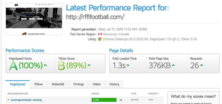
Yes, they sometimes give you information that you can do nothing about – but sometimes they actually can help. Slow websites lose business.
Sloppy Code
What if you had your website designed years ago by the college student who needed some ‘test’ clients? Could the backend of your site be hurting your PageRank?
You might have some broken links (PowerMapper) or maybe the whole backend is a mess (W3C). If you can’t fix it, you might want to start from scratch.
Digital Marketing Game a Mess?
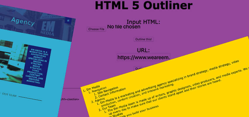
The keywords on your page matter. Not in a <META> sense, but from a content standpoint. Did you know your website should like an outline? I like to think of it as a Table of Contents. That’s how the robots see it and prioritize importance. We also want human users to be happy as well.
Did your website have a lot of Untitled Sections? I hope that’s a focus keyword for your business.
A Little Bit of This, A Little Bit of That
Sometimes you can find a tool that tells you all about – everything. Green usually means good, yellow is mediocre, and red is bad. But sometimes they give grades.
- Varvy
- Nibbler
Do you think Google, Yahoo, and Bing like your website? I’m guessing that the answer is ‘Meh’. This is a pretty long blog – so if you thought your website was really good, why did you make it this far?
The Answer is…..
I am very well aware of the TLDR community. This typically where you land after skimming through the headlines, bullet-points, and pictures. If you did read and check out the links, you know the answer to your question.

About the Author
Eric Hersey
Eric Hersey is a Wheeling Web Designer and Digital Marketing Specialist that has been working in graphic and web design since 1999. He has applied his techniques and knowledge to help craft his own personal brand and hobby sites – but has also helped many brands and businesses grow online using powerful organic search tactics.
